The idea for this brand came from wanting to form a community of like minds—specifically fans of a lighter style, coastal influenced Pinot Noir.
SYNTROPY [ˈsin‧trəpē] (noun) From Greek, syn=together + tropos=tendency
a wholesome association with others
the tendency towards energy concentration, order, organization and life
the evolution of complexity
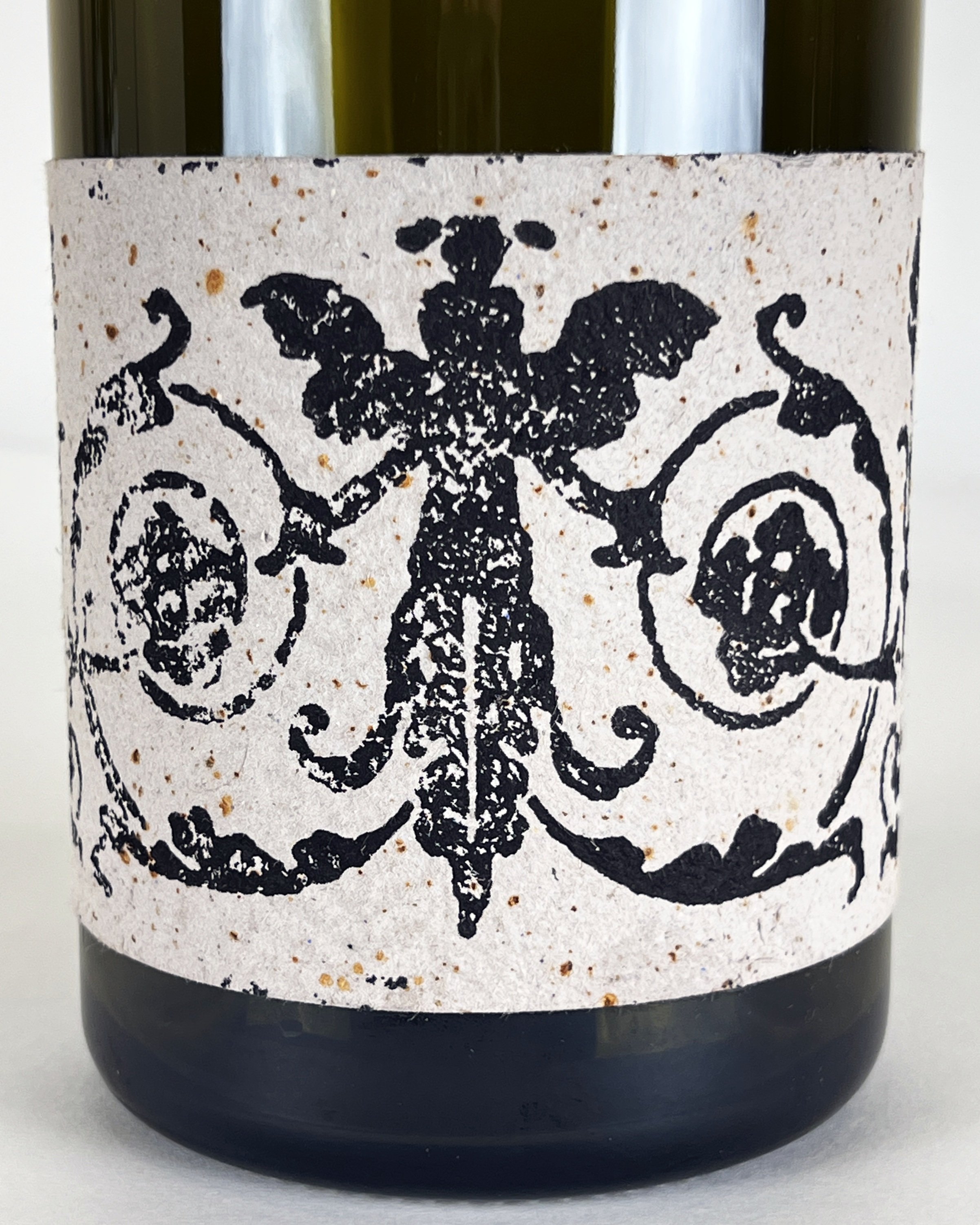
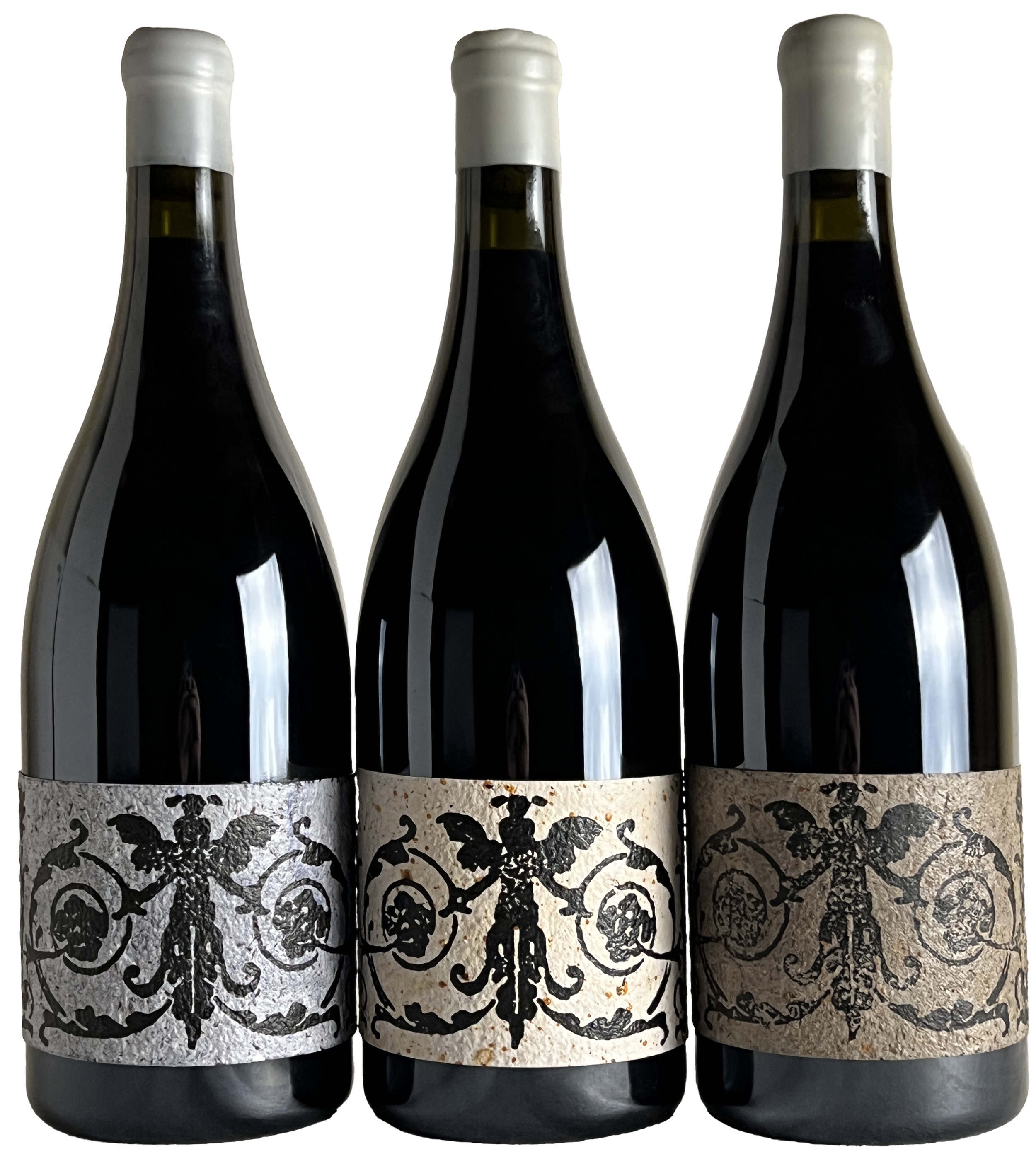
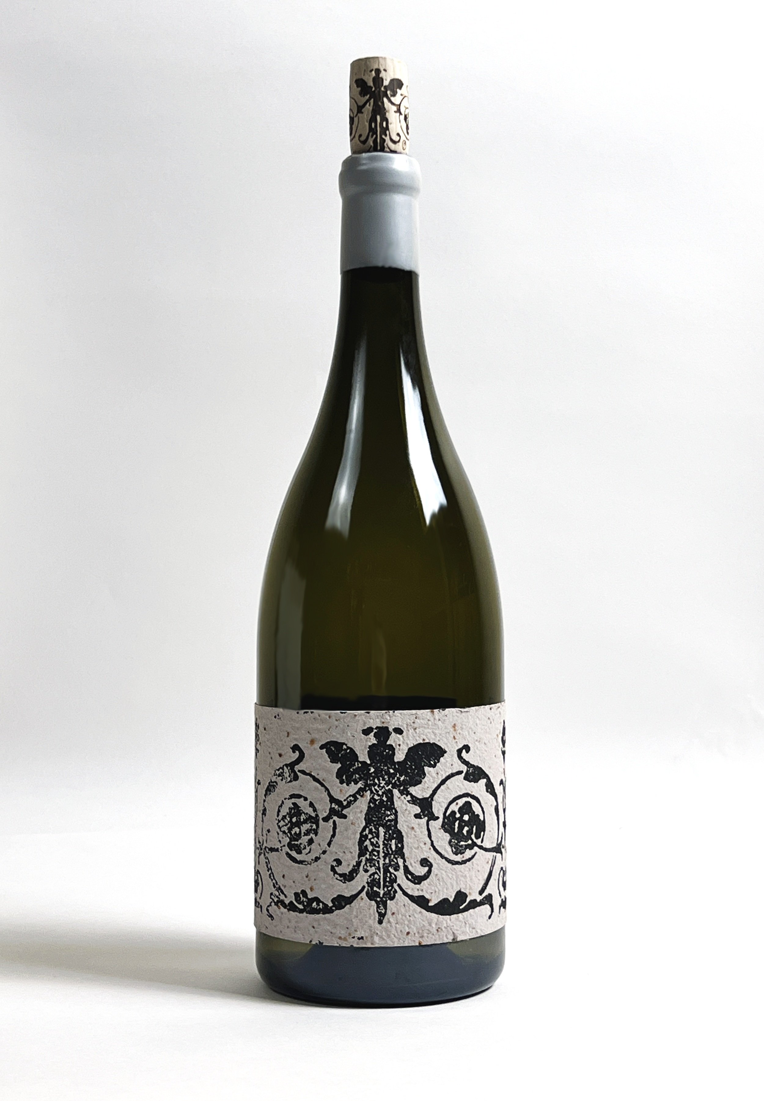
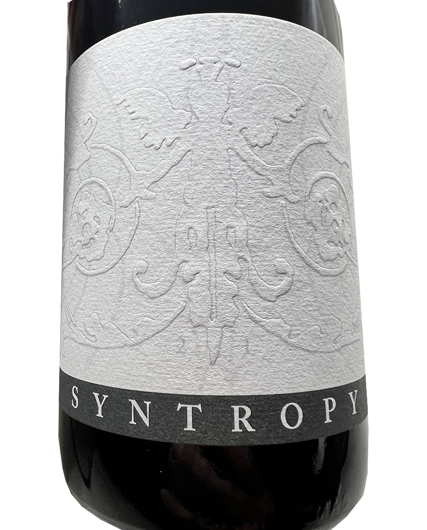
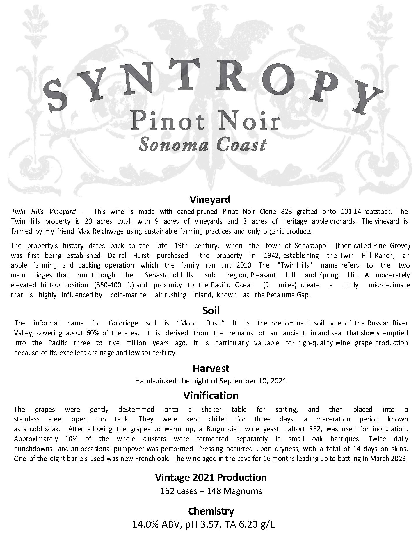
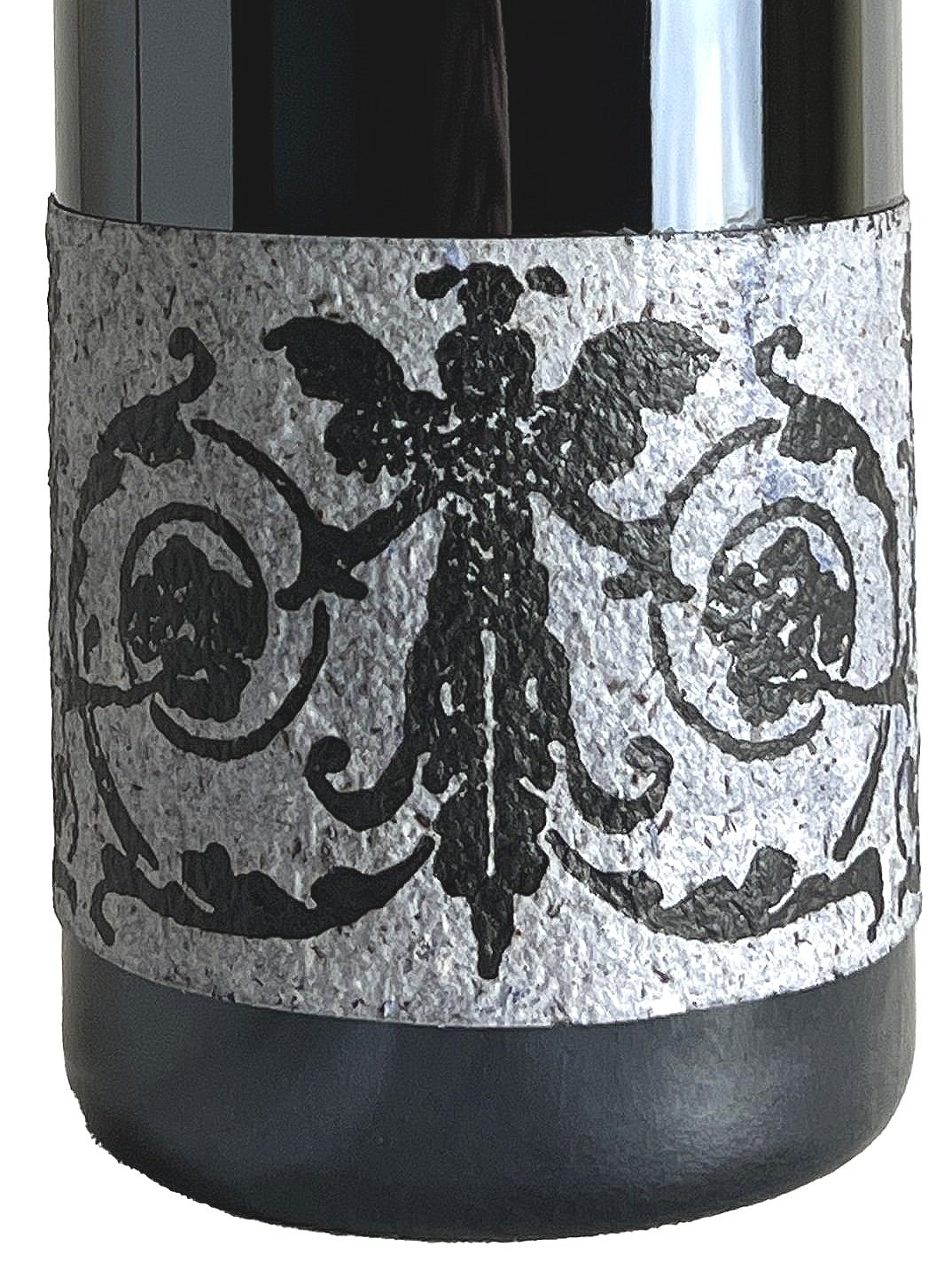
Rather than choose a label that is largely font-based, I decided to go artistic and fully graphical. This allowed me to make a label that is wider than standard. The label utilizes a different aspect ratio and wraps around the bottle to include the full design of an antique letterpress stamp that I acquired nearly 10 years ago.
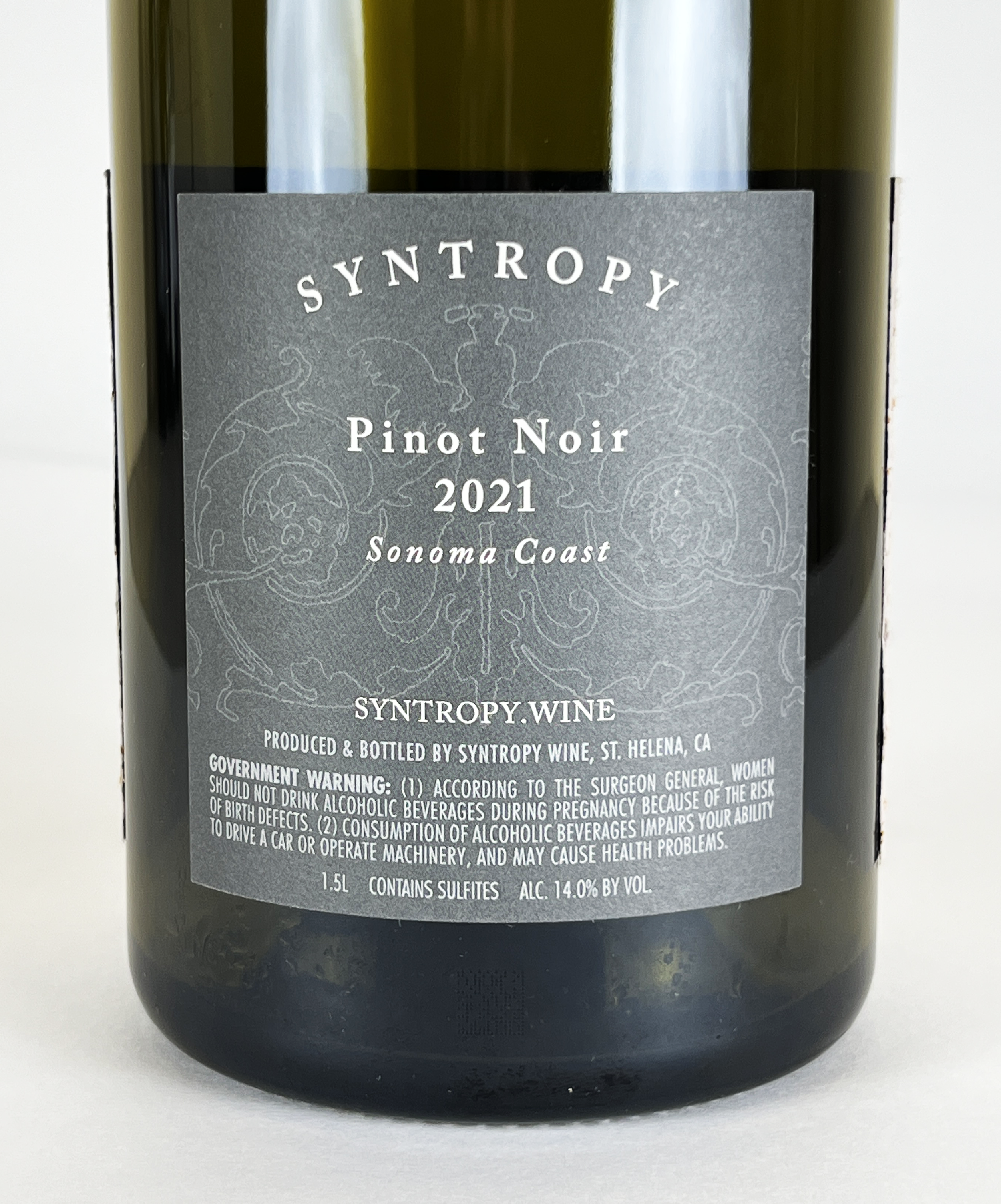
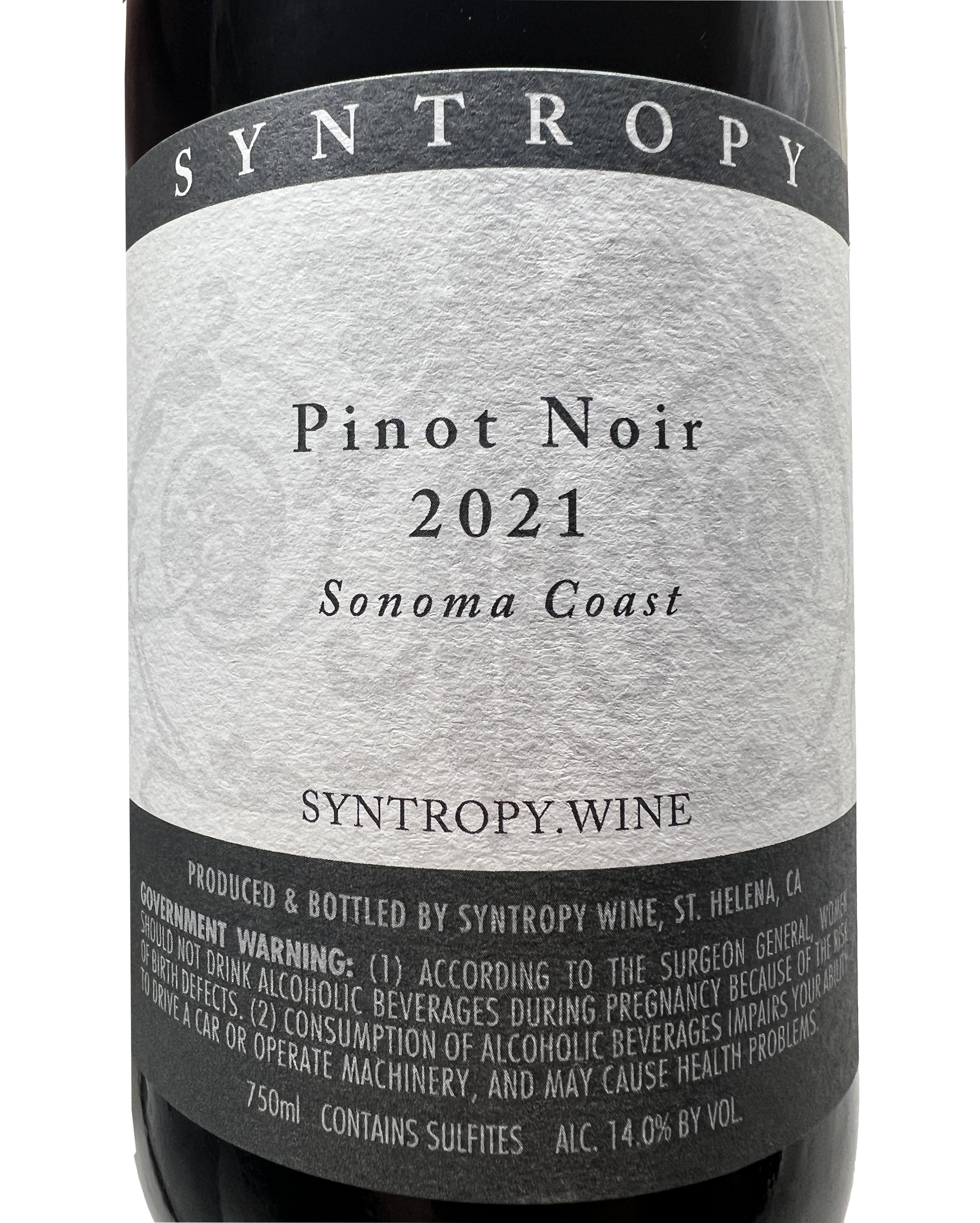
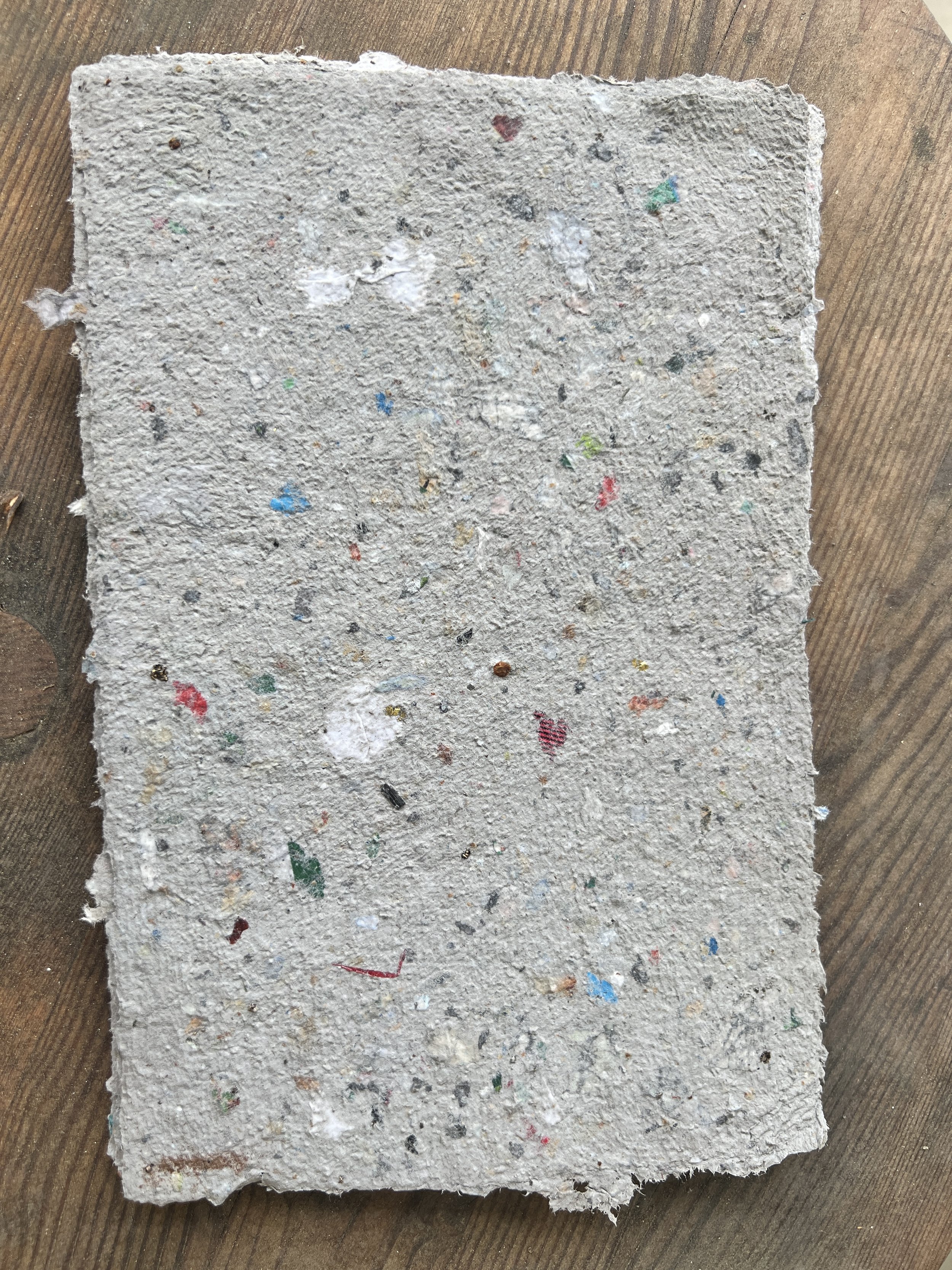
For the 1.5-Liter Magnum bottles, I make a rustic paper using the leftover wrapping paper from Christmas Day with my family. I then print the logo onto the paper using my antique Daughaday Model 1 Improved letterpress, built in the 1880s. The 150 labels get hand glued onto the bottle using an acrylic decoupage to help seal them from light and moisture. The back label is professionally printed and contains all of the relevant legal information.
